Design
SOL Menus
Where Nature Meets Energy:
A Visual Identity for Zuva Energy
We partnered with ZUVA Energy — the only cardiologist-crafted energy shot designed with heart health in mind — to develop a bold and meaningful brand from the ground up. Inspired by the brand’s mission to deliver clean, sustained energy through a balance of nature and science, we created a visual identity that reflects vitality, trust, and purpose. With a name rooted in the Kashmiri word for “life,” our work was guided by a deep connection to wellness and origin. From brand identity to packaging, we helped ZUVA stand out in a competitive market with a look and feel that’s as powerful and intentional as the product itself.

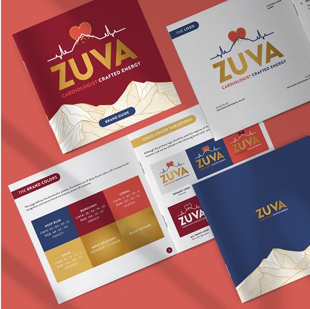
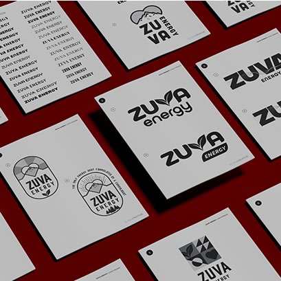
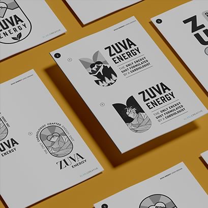
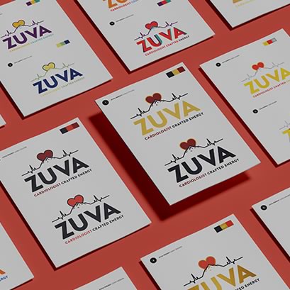
Crafting Zuva’s Custom Logo & Brand
Our logo design process for ZUVA Energy began with a wide range of custom black-and-white concepts. We explored various typefaces, illustration styles, and visual directions — all tailored to reflect the brand’s core values and the client’s creative vision. Through a collaborative, iterative process, we fine-tuned the logo until it struck the perfect balance of strength, clarity, and meaning. With the final design in place, we then shifted focus to color, exploring multiple palettes to ensure the mark stood out while aligning with the natural, energetic essence of the brand.
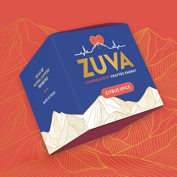
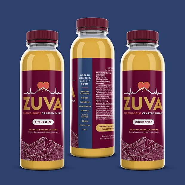
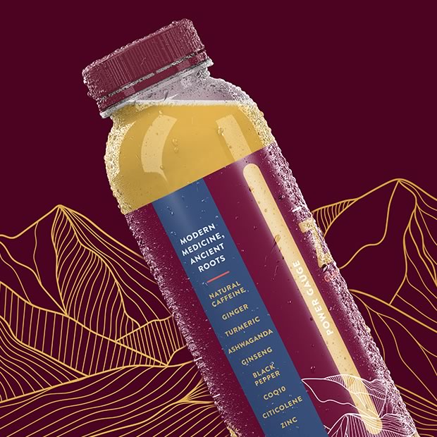
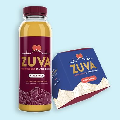
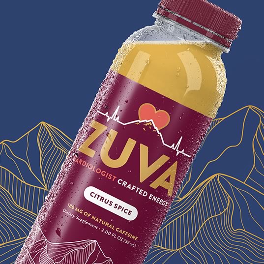
Energetic Packaging With Purpose
With the brand identity in place, we brought ZUVA Energy to life on shelf through custom packaging design for both their bottles and display boxes. Drawing from the brand’s roots and natural energy concept, we incorporated a linear mountainscape inspired by the Himalayas — a nod to the Kashmir region, where the founders are from and where key ingredients originate. We paired this with a bold gold gradient for depth and shine, set against a rich navy and magenta color palette that feels both soothing and energetic. The result is packaging that not only stands out in a saturated market, but also tells a story — balancing tradition, vitality, and innovation in one cohesive visual experience.